Site Navigation & Information Architecture Update
Increased accuracy for global customers by 45% when browsing
Problem Statement: How do we improve click through rate from the navigation?
GoDaddy helps over 20 million users set up and manage their online presence & commerce, about 65% of customers had trouble navigating the site and finding the products that are right for them.
Considerations:
-
How does the current information architecture (IA) perform?
-
How does the customer name and group our products?
-
Do customers group products differently than current state, grouped by org structure?
-
What do our competitors do?
-
Wayfinding broke on category pages. No clear way to navigate from product to product.
-
Is there an opportunity to include ads and/or category specific helpful information within the menu?
My Role:
As UX Lead my first step is to gather requirements. To gather requirements and understand the goals of the project, I conducted interviews with product managers, SEO, Sr. Leadership, Engineering, and the usability research team. Through my interviews, I discovered that the biggest concern among stakeholders was related to merchandising. Specifically, there was a need to improve the way in which products were being displayed and marketed on the site. And, wayfindings, customers were having a difficult time navigating from home page to product and finding what they were looking for.

What do we want to accomplish?
-
Reduce redundancy in nav to improve Google ranking
-
Improve conversion rate when browsing from navigation menu
-
Look at ways to merchandise from the within the navigation menu itself
-
Accuracy from nav for the user to find what they need should be at least 80%
Once requirements are gathered and the goals of the project determined, a timeline is discussed with each step of the project outlined.

Next Step, User Testing - What do our customers think?
2 user studies performed. An unmoderated user study performed with 25 participants to give insights on their journey navigating the site as well as a card sort, to help determine navigation structure.
Who is our target customer?
-
Global non-techie, nascent small business owners
-
Small — mid size business owners
-
Professional designers & developers
-
Investors
-
Stakeholders

Goals:
-
To learn how users categorize and label our (Front of Site) FoS information.
-
To enhance FoS usability by creating an intuitive top-level information architecture that reflects how users view the content.
The study:
-
To learn how well the current information architecture (IA) performed I did an un-moderated study, asking participants questions on navigating the site to see where they were experiencing issues.
-
A navigation tree test card sort was performed on the current navigation to see how users organize the content.
-
I also asked users how they would name each category once they organized the information.
-
I reorganized and renamed our content in multiple ways based on products, jobs to be done, and customer type.

Wireframes and Prototypes:
-
For most projects I work on, especially something of this size, multiple wireframes layouts are provided. The various wireframes and then put infront of potential customers and additional user studies ran to determine the final design. Interactive prototypes were also created, to give testers the best experience.
-
Wireframes were created for each section of the site, to show how this can be used for all products.
-
Based on the card sort and user testing findings, the navigation structure was redefined and variations rolled out into A/B user testing to determine the best result.
-
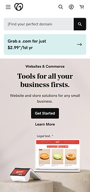
To address the issue of merchandising, I worked with the team to identify solutions that would allow various products to be visually merchandised in the navigation system.
-
On any project both desktop and mobile views are created, with a mobile first mindset.


The Wins!
-
After testing several variations, the most effective version saw a 11.5% increase in CVR (conversion rate) worldwide.
-
Regained 1st page search results for key terms like ‘domain’ and ‘website’ by removing 41 links from nav, restructuring category pages, and improving the information architecture.
-
Improved accuracy by 65% to 85% by measuring click through rate and conversion.
-
To further improve findability and the user experience, I designed and implemented a sub-navigation menu on the category pages. This allowed users to easily locate and access all relevant products, resulting in a 1.3% increase in CVR.